We all need mobiles sites but do we need a responsive site? – August
The stats are in, Australia has the worlds biggest up take of smart phones. With this in mind most sites need some kind of mobile presence. But the question is do we need a plain mobile site or a responsive one?
Most business dont yet know what a “responsive” site is. Don’t worry its a very new term. So let me explain the differences.
Your traditional mobile site would redirect the user to a different url. For example People on a PC would see tyranny.com.au but users on a mobile would see tyranny.com.au/mobile-site or something like mobile.tyranny.com.au.
These traditional mobile sites were great because they allowed you to build a completely unique design just for mobiles.
So what’s the problem?
The problem is because its a separate site you have to enter your content in separately – basically making 2 sites which creates a heap of work for the owner/web guy.
Especially keeping it up to date. The other issue is that mobile sites dont always have the same pages as the normal PC site. And redirecting each page one by one is a pain.
For example to keep it simple a mobile site might only have 3 or so pages. As not to confuse the user. While the PC site might have 10-20 pages.
This creates confusing when searching on a mobile in Google and clicking a result only to be taken to a mobile page that doesn’t have the content you searched for.
How does Responsive fix this?
A responsive site keeps the user on the same url so if they are on a PC or mobile they both see tyranny.com.au. The only thing that changes is the style of the site.
The internet browser knows how big their screen is and so it knows what styles to use.
If they are on a mobile it shrinks the width from say 900 odd pixels to 300 pixels. Shrinking images and text to fit.
So the responsive type of site fixes the above issues by showing the exact same content on every device. No redirecting, just the same content but with a different style.
For this very reason the only down side is that a responsive site keeps that same info from the normal site. So the menu and text all carries over – in some cases this is a lot. Which means a heap of scrolling, which isn’t ideal.
But we can do cleaver things like hide certain parts or put the menu in a drop down box so it doesn’t take up so much room.
Google has put its foot down!
Google has come out and said its best practice to have a responsive mobile site, why? Because your now showing both PC and Mobile users the same content. No funny business about having different text on one version or the other. It also means that anyone searching in Google will see the same page and same text if clicked, making for a much better user experience.
There is even some evidence that Google might start pushing ranks backwards if the mobile sites content isnt as good as the PC version so its very important to use a responsive site.
“Google recommends webmasters follow the industry best practice of using responsive web design, namely serving the same HTML for all devices and using only CSS media queries to decide the rendering on each device.”
Tips for a better website
1. Condense your menu
The shorter the better, long menus and drop downs tend to confuse people. This will also stop them from hitting the back button.
2. Give every page a clear call to action
This might be a button to sign up for a newsletter or to fill out a quote form. Something to give the user a clear indication of what to do next.
3. Cut the music and pop ups out
No one needs to hear your favourite song or pop up that follows them around. Make your videos play only on clicking it.
4. Add social media buttons
This way your customers can easily keep in touch.
5. Add an about page
This will help connect with the potential customer and make the sale that little bit easier.
6. Hire a copywriter
What is quite often said is that a website and copywriters are an investment. This is because they keep giving over time so its best to do it well.
The difference between this kind of investment and an expense is advertising like Adwords – which only gets you that one time sale.
Questions and Answers
Q: How can I get a push in Google maps?
A: Check your domain name information, especially the address. Put your address on your site as well. Now check Google for old business listings and point them to the correct address.
Just for Fun
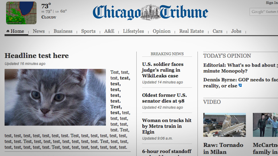
The Chicago Tribune left a article up on their homepage for about 16 mins. The article included a cat photo and test repeated.
This lead to some fun on facebook and twitter.